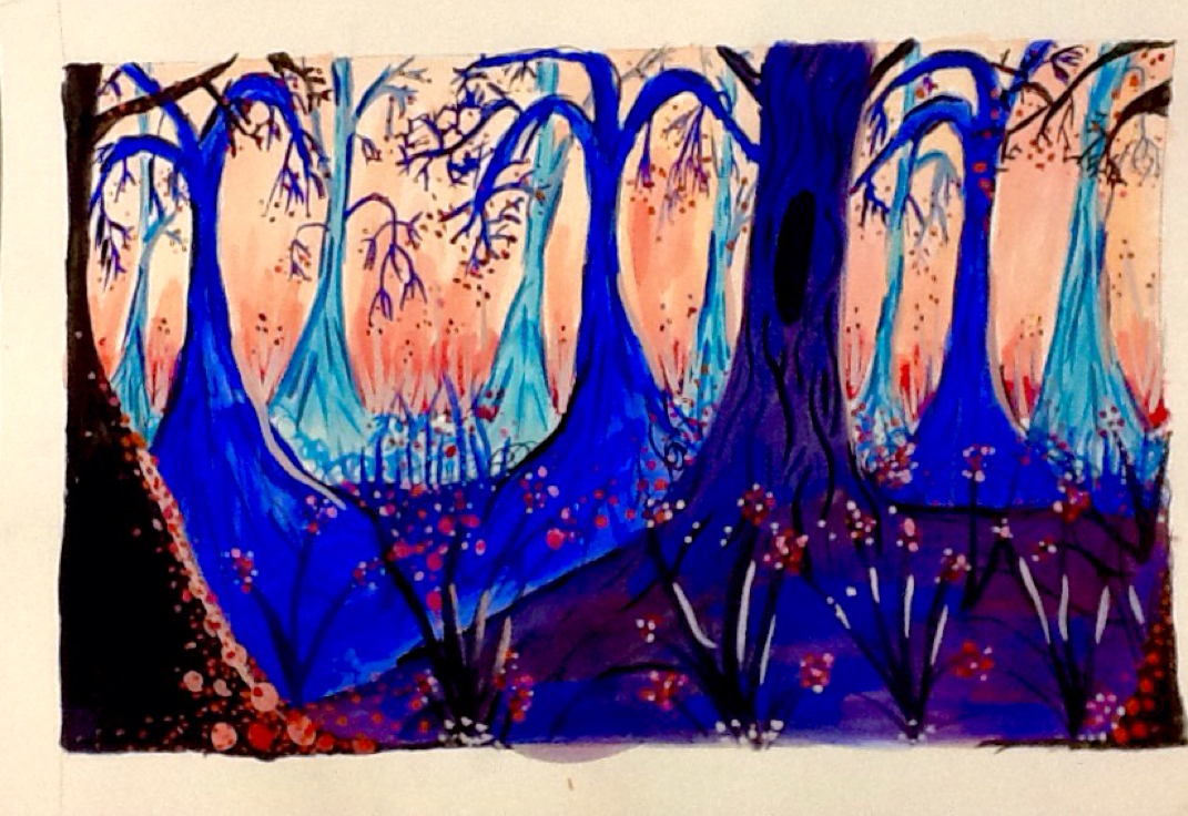
For this painting,I made 6 layers. I started with the sky which fades from red to orange to pink. I painted layered of trees using complimentary colors of blues to blacks. I painted shadows on the edges of branches and lighter shades on the opposite to highlight them. I added dots to add space and value. They were bigger in the front and smaller the further away it was to create distance. Overall, I'm pleased with how it turned out!
My dreamtime is about moving away from my hometown. I started with Washington, but molded it more into the shape of a box. The dots are clustered more towards the Seattle area and eventually form a heart to symbolize where my heart is. The dots slowly get further and further away as they go "outside the box" of Washington. They're white inside of Washington to symbolize innocence. They change color outside of the Washington to show how I changed once put outside of my comfort zone. I will be moving to California for school, so to symbolize my destination I made abstract Palm tree tops and pained them red tones, and painted Washington blue tones to show the climate change. The contrasting colors symbolize the contrasting climates. The black background adds value and makes the other colors stand out. The black space is painted black because it is in the unknown. Overall, I'm please with the image, feeling and story my dreamtime entails. For my project, I did the apple project as an ink drawing. I wanted to improve my shading techniques. I used a mix of stippling, contour lines and cross hatching. The elements I reinforced in my drawing was the use of strong contrast, value and light. The closer together the lines, the darker the image looked. The more spread apart, the lighter it looked. The bigger lines made the image look closer and the smaller lines gave the illusion it was further away. For my final print, I printed yellow and then carved out more of the face and hair. I over printed a mix of red, orange and reds over the yellow. The warm colors went well together. I added contrast with a black Matt to compliment the lighter colors of the print. For my landscape project, I did both a watercolor and acrylic. They both used water, where I used complimentary colors like blue and orange to show the reflection of the sun on the waves. I used horizontal brush strokes to show direction and the movement of the water. For the sky, I gradually went from light to dark to show value. To show shape, I made objects like plants and rocks bigger in front and smaller in the back. Overall, I'm pleased with how these both turned out. For my apples painting, I kept the highlights white. I started with a pale yellow, and then progressively built up color. I made it darker where the shadows fell. With the contrast, it added a sense of depth. I mixed the primary colors to create a different shades. Overall, I'm happy with the way the apples turned out. The highlights and shape is what makes the drawing look realistic.
For my block prints, I overprinted colors. I used contrasting, complimentary colors like blue and pink. I alternated with using the back of the block first for a solid color, or just using the carving side. My block had value because I carved out deep the same depth a face would have. I realized I liked the way a solid color looked because of how detailed my block was. For the first block, I did a mug. I tried saying coffee at first, but it ended up being too hard to carve. I added contour lines on the mug to show shape and value. I put texture in the sky in the shape on snowflakes to show contrast. For my ink drawing I drew my eyes. I'm overall pleased with how it turned out. I effectively mixed stippling, cross hatching and parallel lines to give my portrait depth, contrast and value. What added shape was my use of contour lines along my forehead and cheek bones where the shadows fell. For my portrait, I started with a sketch. I put my eyes in the middle and worked from a picture of myself. I started painting light, then went darker by mixing dark blue in the colors to add shadows. I added a light color in the whites of my eyes so it wasn't as bright. I added texture to my hair by mixing shades of yellow and brown and using light brush strokes. Overall, I'm pleased with my use of color, pattern, contrast that added depth and the proportion of my face.
|
AuthorWrite something about yourself. No need to be fancy, just an overview. ArchivesCategories |