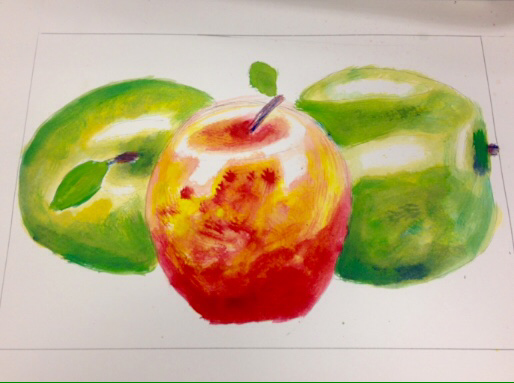
For my apples painting, I kept the highlights white. I started with a pale yellow, and then progressively built up color. I made it darker where the shadows fell. With the contrast, it added a sense of depth. I mixed the primary colors to create a different shades. Overall, I'm happy with the way the apples turned out. The highlights and shape is what makes the drawing look realistic.
 RSS Feed
