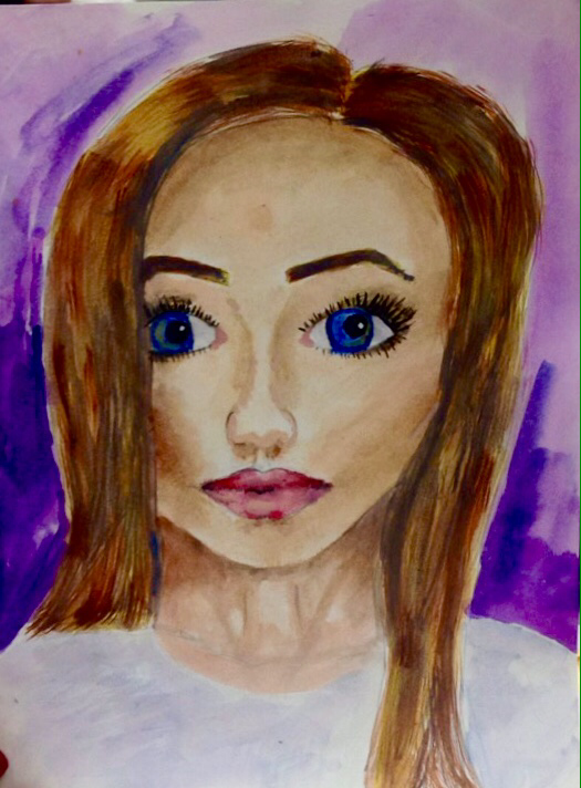
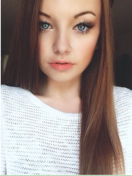
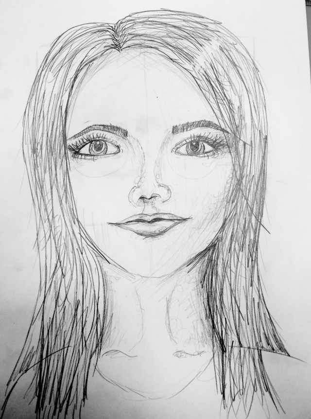
For my portrait, I started with a sketch. I put my eyes in the middle and worked from a picture of myself. I started painting light, then went darker by mixing dark blue in the colors to add shadows. I added a light color in the whites of my eyes so it wasn't as bright. I added texture to my hair by mixing shades of yellow and brown and using light brush strokes. Overall, I'm pleased with my use of color, pattern, contrast that added depth and the proportion of my face.
For my self portrait, I started with a yellow colored pencil to get the proportions right. I put the eyes in the middle, and then filled in the features. After it looked real, I added detail and shadows to add depth. I looked at where the light hit and made it darker under my nose and lips, and also the sides of my face and my cheekbones. Overall, I'm happy with my improvement, but if I was to do it again I would make the eyes closer together. What worked well in this painting was my use of complimentary colors. I avoided black for shadows, and used blue instead. I used white or light yellow for highlights. After it dried, I used a small brush with blue and orange to add in slight detail. This contrast really made the image pop and added depth.
This drawing, I started off with a box. From there I made the lines for the floor and ceiling. I made the vanishing point, and made the lines of the door and lockers all go to them. By having the vanishing point, it added depth and value. I shaded the lockers slightly to add contrast. The most difficult thing about this drawing was have it match up with my table mates drawings.
|
AuthorWrite something about yourself. No need to be fancy, just an overview. ArchivesCategories |