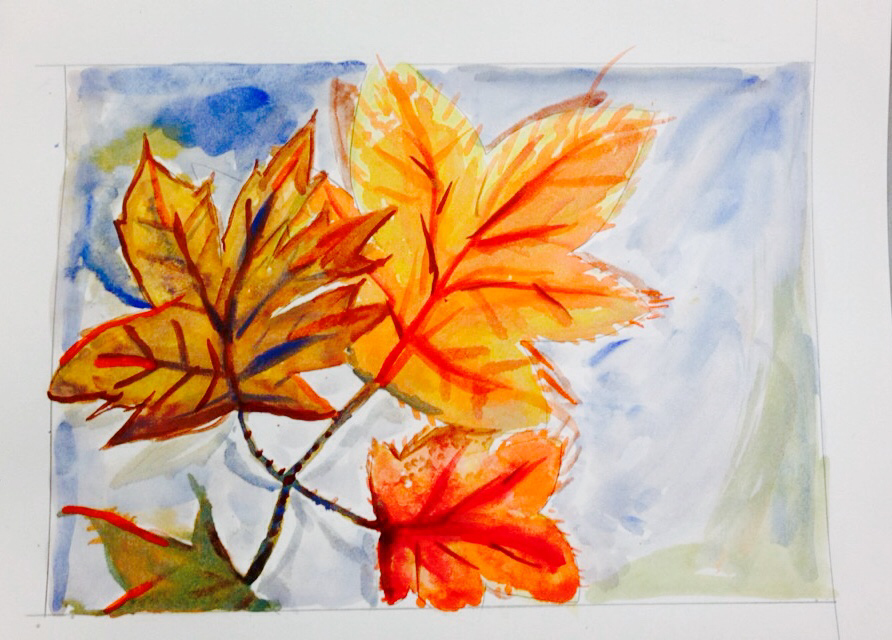
What worked well in this painting was my use of complimentary colors. I avoided black for shadows, and used blue instead. I used white or light yellow for highlights. After it dried, I used a small brush with blue and orange to add in slight detail. This contrast really made the image pop and added depth.
 RSS Feed
