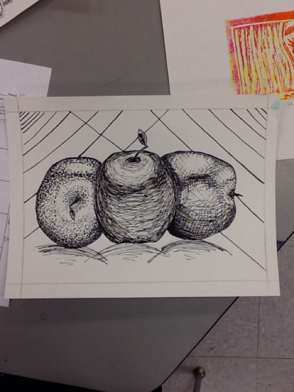
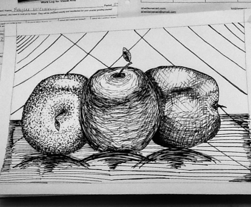
For my project, I did the apple project as an ink drawing. I wanted to improve my shading techniques. I used a mix of stippling, contour lines and cross hatching. The elements I reinforced in my drawing was the use of strong contrast, value and light. The closer together the lines, the darker the image looked. The more spread apart, the lighter it looked. The bigger lines made the image look closer and the smaller lines gave the illusion it was further away.
 RSS Feed
