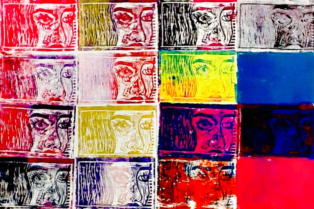
For my block prints, I overprinted colors. I used contrasting, complimentary colors like blue and pink. I alternated with using the back of the block first for a solid color, or just using the carving side. My block had value because I carved out deep the same depth a face would have. I realized I liked the way a solid color looked because of how detailed my block was.
 RSS Feed
